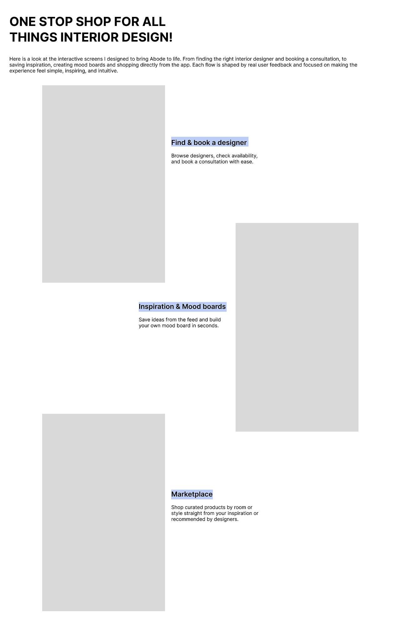
.png)
.png)


.png)


.png)


What's next?
To elevate Abode further, I’d refine the UI to strengthen the brand’s professionalism and expand the profile section to show how users receive and purchase products. I’d also explore light/dark mode options to improve accessibility and showcase the full journey from inspiration to home transformation.
challenges
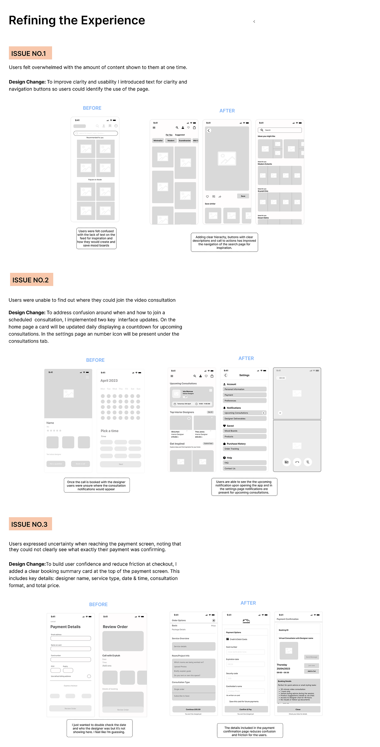
Usability testing revealed that users struggled to navigate Abode especially when trying to find designers or complete a payment. These were core features, so I returned to my user personas and refined the sitemap to improve clarity. With time lost, I also refreshed the visual design by introducing more white space and using orange and blue accents to make the app feel more professional, friendly and inviting.
final thoughts
With a background in interior design, I’ve always been drawn to how thoughtful design can improve people’s lives. This project allowed me to apply that same user focused mindset to digital spaces, combining aesthetics with functionality. A natural transition from interiors to UX.